Back to Main Menu
Our client wanted to model the installed base of devices. To be clear, by installed base we mean the number of devices in the world. This was important because it would form the first part of a market model.
It is relatively easy to buy data that estimates the number of devices entering a market. In fact, this is really just the number of devices sold each month. However, the problem is that we cannot just sum the number of devices sold to estimate the installed base. This is because a sum of new devices obviously ignores the devices being retired.
It is easy to get the number of new devices because there are relatively few manufacturers in the world. Most manufacturers disclose their production statistics. However, it is just not practical to be told when machines are retired.
Fortunately, we found a good way to solve the problem. Our client had access to telemetry data generated by devices connected to the internet.
Telemetry is data that is produced by a machine as it is working. It is commonly found in engines, race cars and production lines, for instance.
Computer devices will contact their manufacturer to request updates. In order to get the right update, they need to send some information to describe exactly what type of system they are. Consequently our client’s data had a date of manufacture.

Before we ran our experiments we loaded a telemetry file. The file was over 8Gbytes in size. Firstly, we built some statistics. The file had data for 350,000 organizations and 16.1 million devices. Consequently, we were likely to get statistically meaningful results because our sample was large.
Although the file was extremely large in size, our initial analysis required only a small summary of data.
We started by counting the number of devices by age. The result is only about thirty numbers, as you can see in the table on the right.
| Age in Years | Number of Devices | Age in Years | Number of Devices | |
|---|---|---|---|---|
| < 1 | 5,587 | 6 | 1,970,128 | |
| 1 | 404,056 | 7 | 2,040,808 | |
| 2 | 866,026 | 8 | 1,448,587 | |
| 3 | 1,274,588 | 9 | 1,119,827 | |
| 4 | 1,943,260 | 10 | 851,860 | |
| 5 | 2,279,509 | > 10 | …. |
Clearly it is very simple for us to visualize data in a power BI column chart:
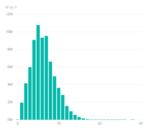
This tells us quite a bit but we can discover a great deal more. For example, it is not immediately clear what the average age of a device is from this chart. In addition, we can’t quickly say what proportion of devices remain after a certain number of years.
Consider our observations as the set [latex]x_t[/latex] where [latex]1 \leqslant t \leqslant T[/latex].
Firstly, we can convert the device counts into probabilities:
[latex]p_t=\frac {x_t} {\sum_{i=1}^T x_i}[/latex]
Secondly, the probabilities can be converted to an empirical cumulative distribution:
[latex]F(t) = \sum_{i=0}^t p_i[/latex] for [latex]t\in \{1, 2, 3, …T\}[/latex]
The Weibull cumulative distribution function (which is continuous) is
[latex]f(x)= 1 – e^{-(x/\lambda)^\kappa}[/latex] for values [latex]x \geqslant 0[/latex].
Finally, by taking logarithms we see:
[latex]ln(1-f(x)) = – (x/\lambda)^\kappa[/latex]
[latex]ln(-ln(1-f(x))) = \kappa (ln(x / \lambda)[/latex]
[latex]ln(-ln(1-f(x)))=\kappa ln(x) -\kappa ln(\lambda)[/latex] which is in the format of a linear equation [latex]y’=\kappa x’ + c[/latex].
Therefore, to see how well our empirical data fits the Weibull distribution we transform our data to calculate [latex]F'(t) = ln(-ln(1-F(t)))[/latex] and [latex]t’=ln(t)[/latex] and plot these points on a scatter diagram.
You can see this on the right.
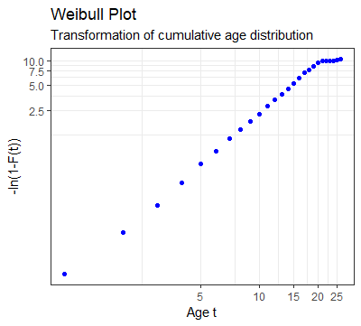
Clearly the observations show a linear pattern until we get to PCs that are older than 20 years.
However, by 20 years the cumulative function is already at 99.99% and so these last few observations can be ignored.
From our scatter plot it is simple to fit a linear regression line to the data. We calculate the fit (from the [latex]r^2[/latex]), the slope and the intercept.
The slope gives us [latex]\kappa[/latex] (the Weibull shape parameter) and from the intercept we can calculate [latex]\lambda[/latex] (the Weibull scale parameter).
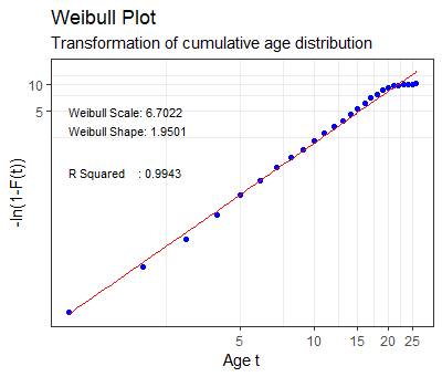
Clearly, we see that the [latex]r^2[/latex] is especially good, but if we had ignored the 0.001% of the sample having over 20 years of age it would be even better.
Probability Density Curve
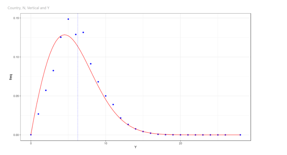
The probability density curve is a function whose value at any given point provides the relative likelihood that the value of the random variable would equal that sample.
The blue dots show the values from the observed data and the continuous red line is the function that we derived.
Cumulative Distribution Curve
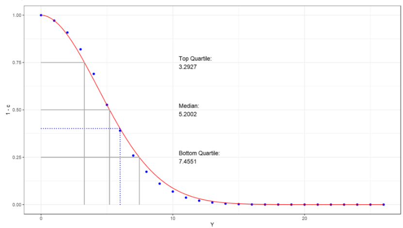
The cumulative distribution curve of a random variable is the probability that the variable will take a value less than or equal to x.
It gives the area under the probability density curve from minus infinity to x.
Putting It Together
The Weibull distribution has an excellent fit. We calculated the curve for the entire population of devices as a proof of concept. However, it is easy to compute the curves for subsets of the data. For example, we discovered that different countries have different lifespans for devices. We also discovered that different industries have different lifespans.
One major benefit of our analysis was that we were able to challenge the businesses’ estimate of average life which was quite incorrect.
By taking thousands of survival curves and overlaying shipment data we had a good basis to create a strong market model compared to previous models.