Per Microsoft, Power BI is a business analytics solution that allows users to visualize data and share insights across an organization, or embed them in an app or website.
For the Power BI demonstrations, we will use Microsoft’s ContosoSalesForPowerBI dataset.

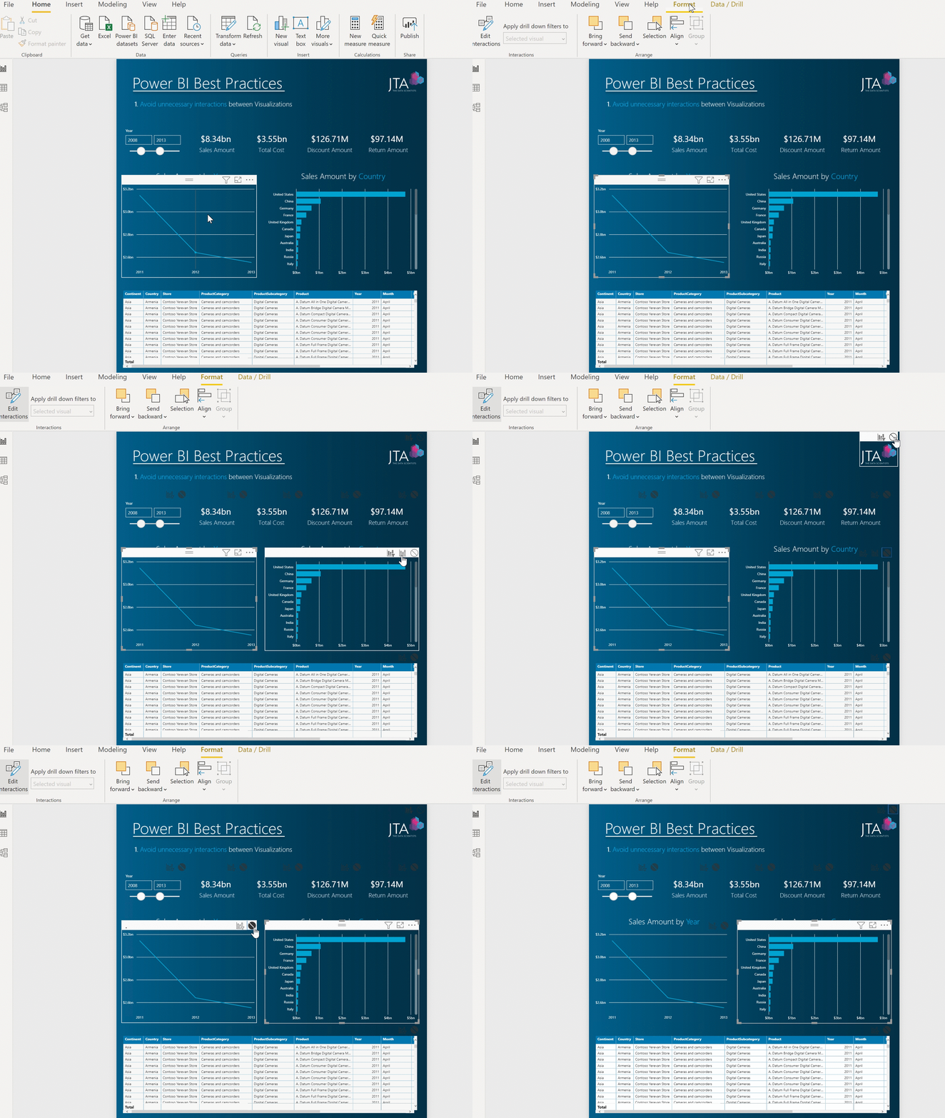
unnecessary interactions
- Visualizations on a report page can be used to interact with the other visualizations on the page (cross-filter/cross-highlight). Queries are generated by having interactions between visualizations.
- By default all visuals, in a report page are interactive with each other, however, this interactivity can be controlled and modified.
- Improve performance by reducing the number of queries sent through the source model by disabling unneeded interactions.
2. Define intuitive names to report fields
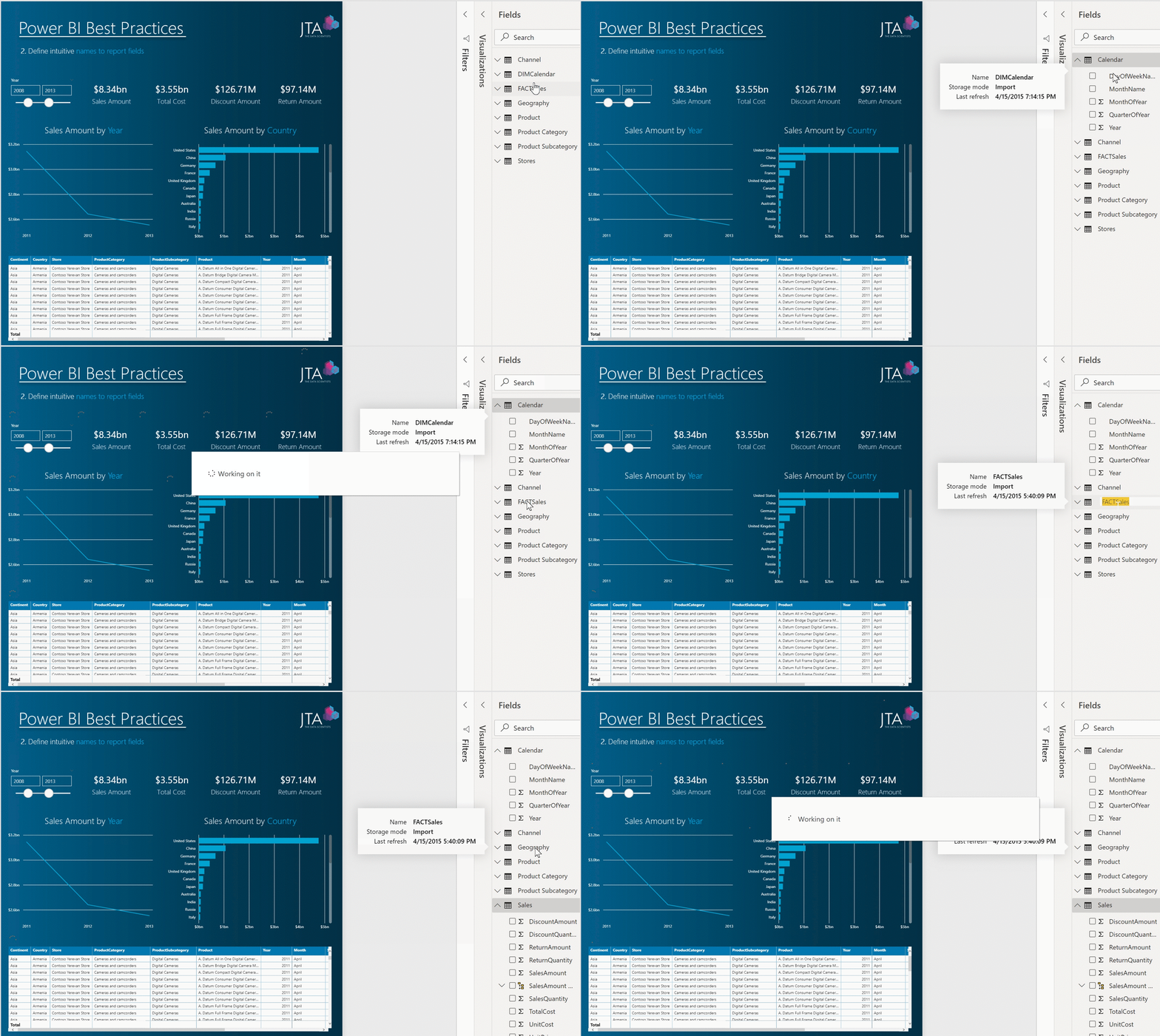
- Column, Tables , and Measures should be named contemplating the report’s audience.
- Providing clear, intuitive, and user-friendly naming will improve the report’s user experience.
- Avoid the use of database or cube naming conventions.
3. Develop a Storytelling visualization
- Data visualization per se it’s not enough to provide the most meaningful insights.
- All reports must aim to tell a story and merge two worlds: Data and Human Engagement.
- A storytelling report is an effective way to generate valuable insights and assign meaning and context to data.
- To develop a storytelling report, key factors such as the following must be addressed:
- Understanding the report audience
- The message and needs to help drive the audience’s decision
- Using the right visualization for the data
- Placing and accentuating the most important information
4. Disable Auto date/Time setting
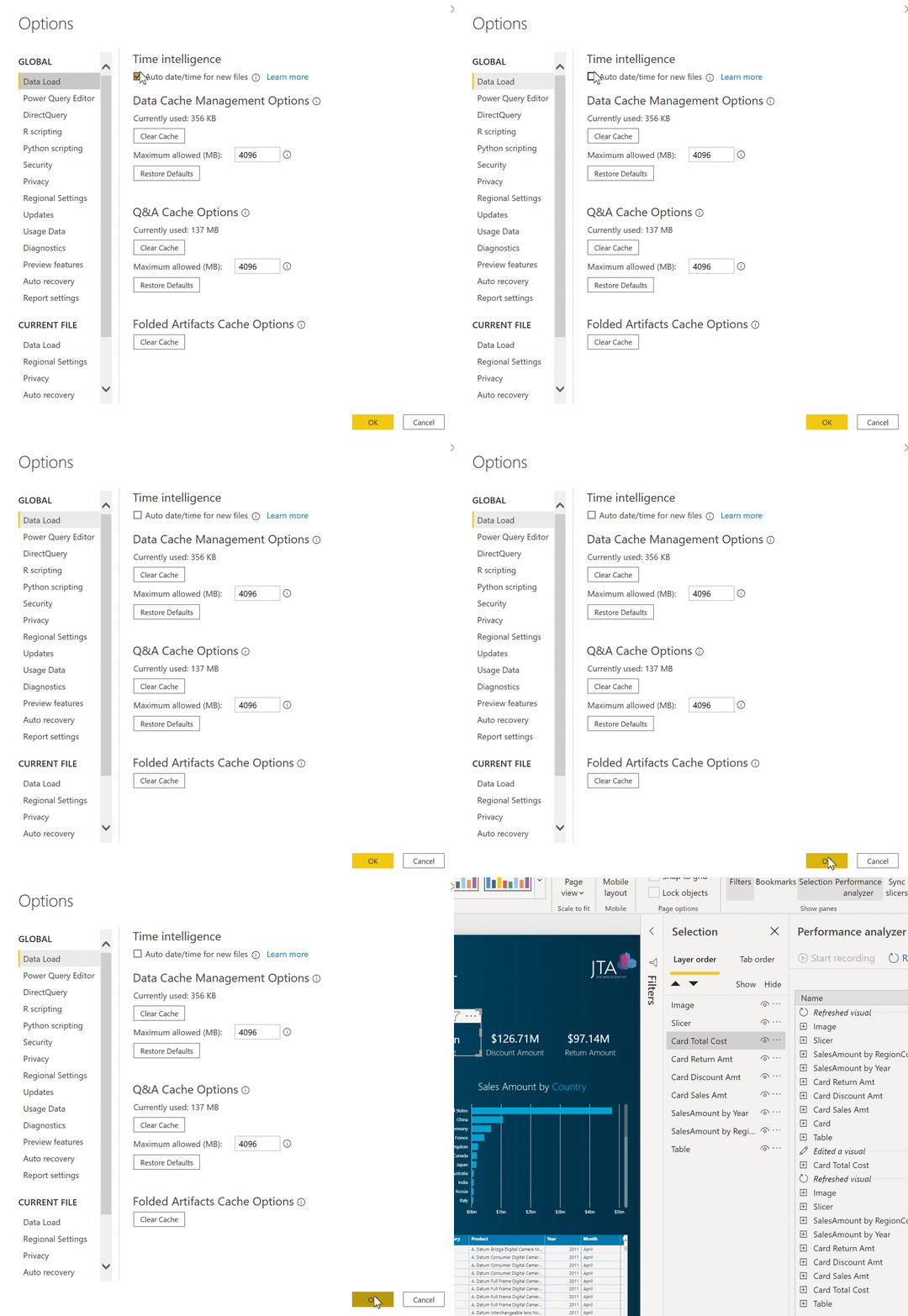
- For new files, by default, Power BI automatically creates a hidden date table for each field in the model that has a Date or Date/Time data type.
- The pbix file size, with a model Date or Date/Time data type, will reduce by disabling this setting.
- The Auto date/Time can be disabled on the Data Load Tab under Current File.
5. Enable Hide Visual Header in Reading View setting
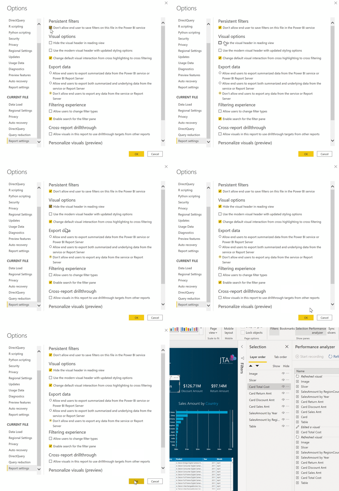
- Visual Header in Reading View allows end-users to perform actions, such as opening the visual in focus mode or drilling.
- Reading View includes Power BI service, Publish to web reports, and any other embedding experience.
- If there is no business need for the user to perform these actions, then the visual header in the reading view should be hidden.
- To disable visual header, check the Hide the visual header in the reading view box in the Report settings section in the Options dialog.
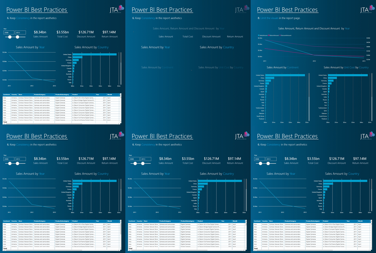
6. Keep Consistency in the report aesthetics
- Report look consistency is key to aid consumers in identifying and comprehending trends, outliers, and patterns in data.
- Apply font size, type, and color with the same consistency.
- Define spacing between the same genre of visuals.
- Create or define a Theme and/or page background across the report.
- Define user-friendly labels for report tabs.
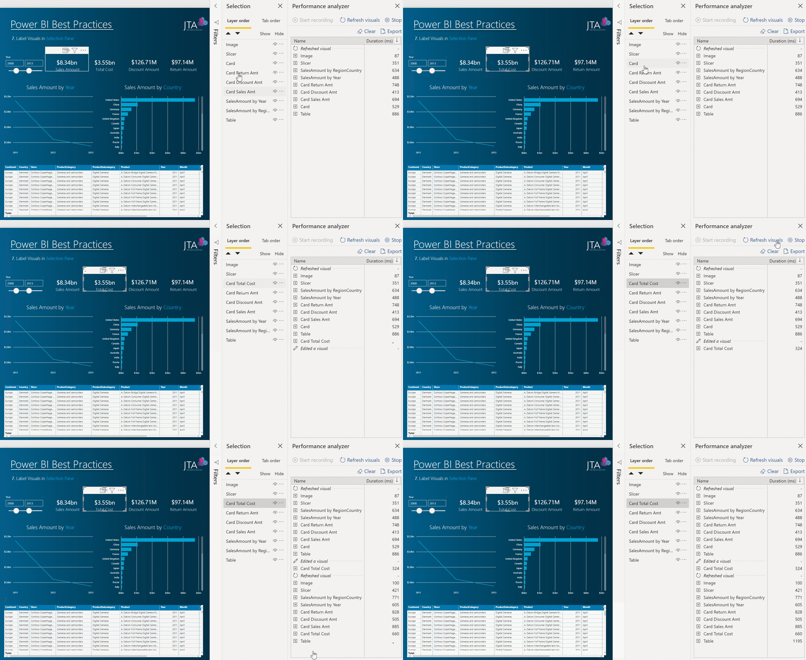
7. Label Visuals in Selection Pane
- Report performance is impacted when a table/matrix is surfacing over thousands of rows in a table. The more data, a visual need to display, the slower that visual is to load.
- Every visual when created has automatically a label associated to it.
- When there is more than one item of the same type (e.g.: text box), the labels in the selection pane will be the same and not possible to distinguish.
- Properly labeling all visuals, will not only allow having a selection pane hygiene but also use tools such as Performance Analyzer with better efficiency, as all visuals are distinguished.
- Grouping and/or sorting the same type of visuals will also help to better organize the selection pane.
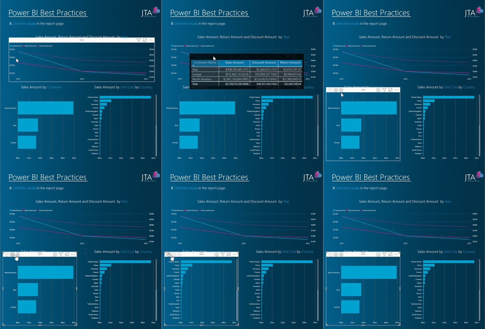
8. Limit the number of visuals in the report page
- Don’t overwhelm users with several visualizations and data on a report, just present what is necessary.
- Goal to establish a balance between providing consumers with good insights and the amount of visuals.
- Use drill-drowns and tooltips to provide more contextual information and detail to visuals.
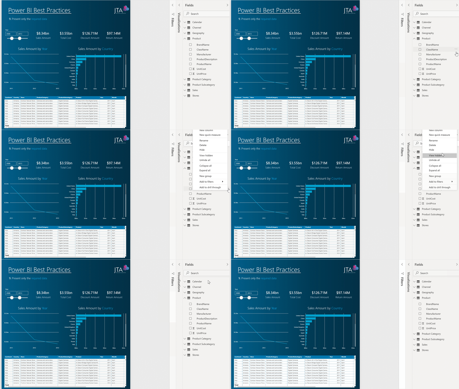
9. Present only the required data
- Instead of providing all the information available, just import/ make visible the fields, tables, and measures that will be used in the visuals.
- If any of these don’t contribute to a visual, filter, selection, then there’s no need to make it available in the report.
- Improves consumer report experience.
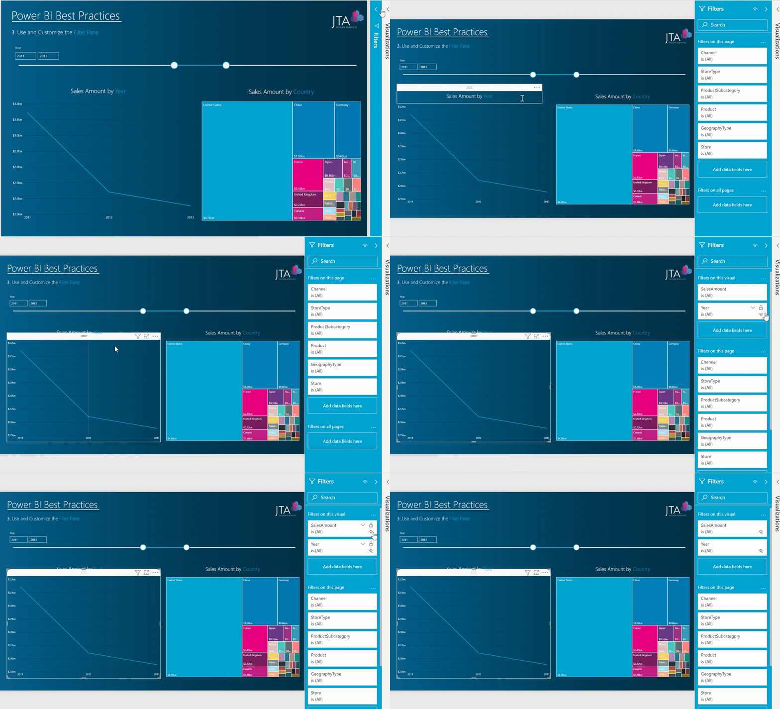
10. Use and Customize the Filter Pane
- The filter pane allows users to save report canvas space as well as improve performance, being as these filters are not visible and therefore not loading.
- Users can lock, hide, or rename filters or customize the pane to ensure the best experience for their report consumers.
- Close the filter pane upon report loading, as it improves slightly the report rendering page.
- All fields in filters on this visual should be hidden to the consumer.
Other Documentation
There are several articles, blog posts, whitepapers about Power BI best practices. Next, we recommend some documentation that we consider insightful:
-
- Microsoft: https://docs.microsoft.com/en-us/power-bi/power-bi-reports-performance
- Better Concepts: http://www.bconcepts.pt/powerbi-best-practices/
- Paul Turley’s SQL Server BI Blog: https://sqlserverbi.blog/2019/08/24/power-bi-project-good-and-best-practices/
